Math Assignment Help With Pie charts
14.5 Pie charts:
A pie chart is a graphical representation of how many individual parts contributes to the total. A pie chart is a circular chart divided into sectors. In a pie chart, the arc length of each sector is proportional to the quantity it represents.


Constructing Circle Graphs
Study the following steps of constructing a circle graph:
Step 1: Calculate the angle of each sector, using the formula
Angle of sector = Frequency of data x 360o/Total frequency
Step 2: Draw a circle using compasses
Step 3: Use a protractor to draw the angle for each sector.
Step 4: Label the circle graph and all its sectors.
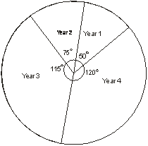
Example: in an medical survey it was found that, in year 1 there were 10 cases of malaria, in year 2 it increased to 15, in year 3 there were 23 such cases and in year 4 again a rise of about 20 cases. Draw a circle graph to represent the number of cases per year.
Total number of cases: 10+15+23+24 = 72
In year 1: 20 x 3600 = 500
72
In year 2: 15 x 3600 = 750
72
In year 3: 23 x 3600 = 1150
72
In year 4: 24 x 3600 = 1200
Email Based Homework Help in Pie charts
To submit Pie charts assignment Click here.
Following are some of the topics in Percentages And Pie Charts in which we provide help:
Geometry Help | Calculus Help | Math Tutors | Algebra Tutor | Tutorial Algebra | Algebra Learn | Math Tutorial | Algebra Tutoring | Calculus Tutor | Precalculus Help | Geometry Tutor | Maths Tutor | Geometry Homework Help | Homework Tutor | Mathematics Tutor | Calculus Tutoring | Online Algebra Tutor | Geometry Tutoring | Online Algebra Tutoring | Algebra Tutors | Math Homework Helper | Calculus Homework Help | Online Tutoring | Calculus Tutors | Homework Tutoring