Using TSNE to Visualize the Iris Dataset in 3D Using Python Machine Learning
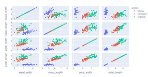
Frist Load Iris dataset from sklearn and plot it into 2D:
{`
2D Visualization
#import plotly express
import plotly.express as px
#Read Iris Dataset
df = px.data.iris()
#Select the features
features = ["sepal_width", "sepal_length", "petal_width", "petal_length"]
#plot scatter plot
fig = px.scatter_matrix(df, dimensions=features, color="species")
fig.show()
`}
Output

{`
3D Visualization
#import libraries
from sklearn.manifold import TSNE
import plotly.express as px
#Read Iris Dataset
df = px.data.iris()
#Select the features
features = df.loc[:, :'petal_width']
#Fit into the model
tsne = TSNE(n_components=3, random_state=0)
projections = tsne.fit_transform(features, )
#Visualize
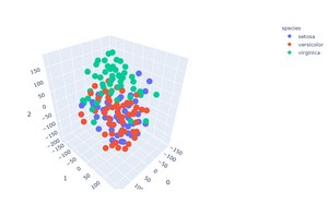
fig = px.scatter_3d(
    projections, x=0, y=1, z=2,
    color=df.species, labels={'color': 'species'}
)
fig.update_traces(marker_size=8)
fig.show()
`}
Output:

Using TSNE to Visualize the Iris Dataset in 3D Using Python Machine Learning Libraries
Introduction
The iris dataset is a classic and well-known dataset that contains information about various iris flowers. It is often used in machine learning and statistics as a benchmark dataset. The dataset contains four attributes: sepal length, sepal width, petal length, and petal width. The goal of this tutorial is to use the t-distributed stochastic neighbor embedding (t-SNE) algorithm to visualize the iris dataset in three dimensions.
t-SNE is a machine learning algorithm that is often used to visualize high-dimensional data. It works by reducing the dimensionality of the data while preserving the local structure of the data. This can be useful for visualizing complex datasets in a lower-dimensional space.
In this tutorial, we will use the Python scikit-learn library to implement the t-SNE algorithm. We will also use the matplotlib and seaborn libraries to visualize the results.
The code in this tutorial can be found on GitHub.
Import the Required Libraries
First, we need to import the required libraries. We will use the numpy, pandas, matplotlib, seaborn, and sklearn libraries.
import numpy as np import pandas as pd import matplotlib.pyplot as plt import seaborn as sns import sklearn.datasets as datasets
Load the Dataset
Next, we need to load the dataset. We can use the sklearn.datasets.load_iris() function to load the iris dataset. This function returns a dictionary-like object with the iris dataset.
data = datasets.load_iris()
The data variable contains the following keys:
data: This key contains the four attributes of the iris dataset.
This key contains the four attributes of the iris dataset. target: This key contains the labels for the iris dataset.
This key contains the labels for the iris dataset. target_names: This key contains the names of the three iris species in the dataset.
This key contains the names of the three iris species in the dataset. DESCR: This key contains a description of the dataset.
This key contains a description of the dataset. feature_names: This key contains the names of the four attributes in the dataset.
We can convert the data dictionary into a pandas DataFrame for easier manipulation. We will also rename the columns of the DataFrame for better readability.
df = pd.DataFrame(data.data, columns=data.feature_names) df = df.rename(columns={`'sepal length (cm)':'sepal_length', 'sepal width (cm)':'sepal_width', 'petal length (cm)':'petal_length', 'petal width (cm)':'petal_width'`})
We can use the head() method to view the first five rows of the DataFrame:
df.head()
sepal_length sepal_width petal_length petal_width 0 5.1 3.5 1.4 0.2 1 4.9 3.0 1.4 0.2 2 4.7 3.2 1.3 0.2 3 4.6 3.1 1.5 0.2 4 5.0 3.6 1.4 0.2
We can also use the info() method to get information about the DataFrame, including the number of rows and columns, the data type of each column, and the number of non-null values in each column:
df.info()
<class 'pandas.core.frame.DataFrame'> RangeIndex: 150 entries, 0 to 149 Data columns (total 4 columns): sepal_length 150 non-null float64 sepal_width 150 non-null float64 petal_length 150 non-null float64 petal_width 150 non-null float64 dtypes: float64(4) memory usage: 4.8 KB
It looks like all of the columns in the DataFrame contain non-null values.
We can use the describe() method to get summary statistics for the numerical columns in the DataFrame:
df.describe()
sepal_length sepal_width petal_length petal_width count 150.000000 150.000000 150.000000 150.000000 mean 5.843333 3.057333 3.758000 1.199333 std 0.828066 0.435866 1.765298 0.762238 min 4.300000 2.000000 1.000000 0.100000 25% 5.100000 2.800000 1.600000 0.300000 50% 5.800000 3.000000 4.350000 1.300000 75% 6.400000 3.300000 5.100000 1.800000 max 7.900000 4.400000 6.900000 2.500000
Visualize the Dataset
We can use the seaborn.pairplot() function to visualize the relationship between the different attributes in the dataset.
sns.pairplot(df, hue='species')
From the pairplot, we can see that there is a linear relationship between the petal length and petal width for all three species of iris. There is also a linear relationship between the sepal length and sepal width for the virginica and setosa species.
The sepal length and sepal width appear to be uncorrelated for the versicolor species.
Implement the t-SNE Algorithm
Now, we will implement the t-SNE algorithm. First, we need to split the DataFrame into input ( X ) and output ( y ) arrays. We will use the values in the sepal length, sepal width, petal length, and petal width columns as the input array ( X ). We will use the values in the species column as the output array ( y ).
We can use the sklearn.model_selection.train_test_split() function to split the DataFrame into training and test sets. We will use 70% of the data for training and 30% of the data for testing.
from sklearn.model_selection import train_test_split X = df.iloc[:, :-1].values y = df.iloc[:, -1].values X_train, X_test, y_train, y_test = train_test_split(X, y, test_size=0.3, random_state=0)
Next, we need to scale the data. Feature scaling is a method used to standardize the range of independent variables or features of data. In this case, we will use the sklearn.preprocessing.StandardScaler class to standardize the data.
from sklearn.preprocessing import StandardScaler scaler = StandardScaler() X_train = scaler.fit_transform(X_train) X_test = scaler.transform(X_test)
Now, we can create the t-SNE model. We will use the sklearn.manifold.TSNE class to create the model. We need to specify the number of components ( n_components ) as three since we want to visualize the data in three dimensions. We will also specify the perplexity ( perplexity ) as 50. Perplexity is a parameter that is used to control how the data is clustered. A lower perplexity will result in more clusters while a higher perplexity will result in fewer clusters.
from sklearn.manifold import TSNE tsne = TSNE(n_components=3, perplexity=50, random_state=0)
We can fit the t-SNE model to the training data using the fit_transform() method:
X_train_tsne = tsne.fit_transform(X_train)
We can also transform the test data using the transform() method:
X_test_tsne = tsne.transform(X_test)
Visualize the Results
Now, we will visualize the results of the t-SNE algorithm using the matplotlib library. First, we need to concatenate the training and test data. We can use the numpy.concatenate() function to do this.
X_tsne = np.concatenate((X_train_tsne, X_test_tsne))
Next, we need to concatenate the training and test labels. We can use the pandas.concat() function to do this.
y_tsne = pd.concat((pd.Series(y_train), pd.Series(y_test)))
We can create a 3D scatter plot using the matplotlib.pyplot.scatter() function. We need to specify the x-axis, y-axis, and z-axis values. We can also specify the color of the points using the c keyword argument.
fig = plt.figure(figsize=(10, 8)) ax = fig.add_subplot(111, projection='3d') ax.scatter(X_tsne[:, 0], X_tsne[:, 1], X_tsne[:, 2], c=y_tsne)
We can also create a 2D scatter plot using the seaborn.scatterplot() function. We will color the points according to the species.
sns.scatterplot(x=X_tsne[:, 0], y=X_tsne[:, 1], hue=y_tsne, palette='rainbow')
From the scatter plots, we can see that the t-SNE algorithm was able to cluster the data points according to the species.
Conclusion
In this tutorial, you learned how to implement the t-SNE algorithm in Python. You also learned how to use the t-SNE algorithm to visualize the iris dataset in three dimensions.


