Works with the same logic the stacked column chart
Using Chart Controls❘609
Chart Types
➤ At run - time, an InvalidOperationException is raised with the following message: “ The chart area contains incompatible chart types. ”
When you add data points to a series, each DataPoint instance may have exactly one X value (defi ned by the XValue property) and one or more Y values (defi ned by the YValues property). Earlier in this chapter, you saw samples that utilized only one Y value per data point, but there are chart types (for example Range, Bubble, Candlestick, and Stock charts) that require more (two or four) Y values.
Column and Bar Charts
The most frequently used charts are column chart s representing each value as a column.
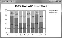
When you use more than one series in a column chart, you can display them with a stacked
column chart . This kind of chart is very good when you combine data values from sub - values represented by separate series. For example, when you have sales numbers for two or more products represented by data series, the stacked column chart can also display the sum of sales numbers, as shown in Figure 14 - 19.Stacked column charts have a custom property with the name StackedGroupName . You can use this property to set which series should be put in a common stack. Series having the same
Bar chart s are very similar to column charts, but they permute the X and Y axes. Figure 14 - 21 shows how the column chart in Figure 14 - 18 looks when you transform it to a bar chart.