

The calculation the lower upper fence yields the actual minimum maximum
BIOSTATS 540 – Fall 2022 2. Data Visualization Solutions – Art of Stat Users (v 10/2/22) Page 1 of 8
Unit 2 – Data Visualization
Solutions – version 10/2/2022
Art of Stat Users
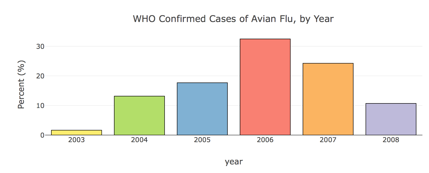
b)By any means you like, construct a bar graph summarization of these data. Include a title and label your axes.
c)State the facts of your bar graph.
BIOSTATS 540 – Fall 2022 2. Data Visualization Solutions – Art of Stat Users (v 10/2/22) Page 2 of 8
__ 1a) Frequency/relative frequency table In Art of Stat, choose your options at left
BIOSTATS 540 – Fall 2022 2. Data Visualization Solutions – Art of Stat Users (v 10/2/22) Page 3 of 8
Question #2
A study examining the health risks of smoking measured the cholesterol (mg/dL) levels of people in two independent groups:
Right click to download: https://people.umass.edu/biep540w/datasets/cholesterol_540.xlsx
sol_visualization art of stat.docx
| Smokers | |||||||||||||||||||||||||||||||||||||||||||
|---|---|---|---|---|---|---|---|---|---|---|---|---|---|---|---|---|---|---|---|---|---|---|---|---|---|---|---|---|---|---|---|---|---|---|---|---|---|---|---|---|---|---|---|
|
2b. Histogram for nonsmokers ONLY
|
|---|
- Online webapps > explore quantitative data > at top, select tab MULTIPLE GROUPS
- > at left enter data: YOUR OWN > at number of groups: 2
sol_visualization art of stat.docx
BIOSTATS 540 – Fall 2022 2. Data Visualization Solutions – Art of Stat Users (v 10/2/22) Page 6 of 8
|
|---|
__ 2e. Interpretation
sol_visualization art of stat.docx
BIOSTATS 540 – Fall 2022 2. Data Visualization Solutions – Art of Stat Users (v 10/2/22) Page 7 of 8
| Smokers (n=43) | Non-Smokers (n=33) |
|---|---|
__ 3b. HACK for you Art of Stat users! Two hacks actually.
Hack #1 - The best way to obtain what you need to complete the table is to construct a side-by-side boxplot.
| Smokers | NON-Smokers | |
|---|---|---|
| Number in group, n = | 43 | 33 |
| P25 = Q1 = Lower Quartile = | 211.5 | 209.75 |
| P50 = Q2 = Median Quartile = | 230 | 238 |
| P75 = Q3 = Upper Quartile = | 264.75 | 264 |
| Interquartile Range (IQR) = | 53.25 | 54.25 |
| 1.5* IQR= | 79.875 | 81.375 |
|
131.625 | 128.375 |
|
155 | 160 |
| 344.625 | 345.375 | |
| 309 | 328 | |
| none | none | |
| 351 | none |
Dear Class – Some notes:
(1) I hovered over the box plot to get more exact figures
(2) Art of Stat is showing whiskers, but is calling them “fences”
(3) Sometimes, the calculation of the lower (or upper fence) yields the actual minimum (or maximum), as occurred here.(4) I calculated the 1.5*IQR by hand
sol_visualization art of stat.docx


