Line Plot with Limits Answer Needed
Your question:
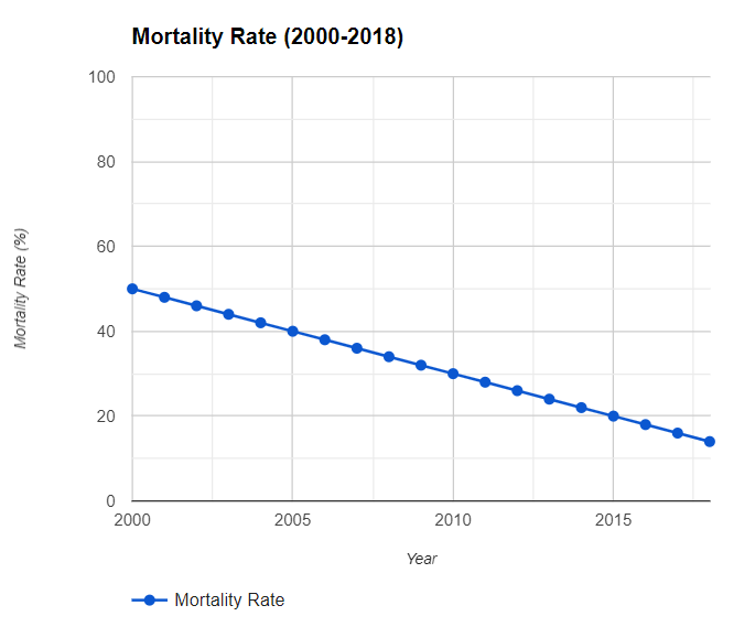
The mortality DataFrames mortality_long mortality_wide nar001-1.jpg nar001-2.jpg Refer to the mortality DataFrames. This code creates a line plot with the x-axis ranging from the year 2000 through 2018 and the y-axis ranging from 0 through 100: mortality_wide.plot.line(xlim=(2000:2018), ylim=(0:100)) mortality_wide.plot.line(x_limit=(2000:2018), y_limit=(0:100)) mortality_wide.plot.line(xlim=(2000,2018), ylim=(0,100)) mortality_wide.plot.line(x_limit=(2000,2018), y_limit=(0,100))
Line Plot with Limits Answer and Explanation